
The Two Gradients – Growth and Margin in the Software Industry [1]

Updated: 1 day ago
Growth and margin [2] dynamics are not uniform across the software industry. Slow growth and thin margins are far more common at the bottom of the industry. But growth and margin do not behave alike: the market pays for growth at every revenue size but pays for margin unevenly.

Growth and margin profiles of 263 software companies sorted by revenue (growth in blue above the line, margin in orange below the line; negatives shown as gray marks on the opposite side)
Introduction
Software companies typically have a target operating model that is based on two fundamental metrics – growth and margin. From these flow other targets for such things as gross margin and operating investments in the form of sales and marketing, research and development (R&D), and general and administrative (G&A) functions.
This paper sorts the industry by revenue bands and analyzes the growth, margin, and Rule of 40 dynamics within each band and across all bands.
Growth thins at every step down the revenue size range
Sort every company by revenue and the distribution of growth rates tilts steadily as the bands get smaller. No company above $5B is shrinking. Below $250M, almost a third are.

The mirror image holds at the other end: a third of the largest band grows above 20%, against an eighth of the smallest.
The distribution is one thing. What the market pays for a position in it is another, as shown in the payoff grid below.

Growth sorts the multiple inside every band, with no inversion at any size. What varies with size is the size of the reward rather than its direction. The $250M–$500M band is nearly flat through the middle, at 2.15x against 2.28x, while the same stretch above $5B runs from 2.66x to 5.42x.
What growth is worth, and when it signals trouble
“How slow is too slow” is really two questions, and they have opposite answers. One is what the market will pay for growth. The other is when slow growth means the business is in trouble. Sorting companies into narrow growth buckets answers both at once — and the two columns that matter run in opposite directions, which is why reading them as one thing is so slippery.
Revenue growth | Companies | Median adj. EBITDA | % negative | Median cap/revenue |
Below −10% | 7 | 2.9% | 43% | 0.68x |
−10% to 0% | 27 | 16.4% | 19% | 1.35x |
0% to 5% | 27 | 20.1% | 7% | 1.56x |
5% to 10% | 42 | 27.7% | 0% | 3.03x |
10% to 15% | 52 | 27.1% | 8% | 3.75x |
15% to 20% | 33 | 24.1% | 3% | 4.79x |
20% to 30% | 47 | 23.3% | 2% | 5.13x |
Over 30% | 22 | 17.5% | 18% | 7.74x |
Take the last column first. It rises without interruption, from 0.68x for the companies shrinking fastest to 7.74x for those growing above 30%. There is no threshold in it anywhere. For valuation the answer to “how much growth” is simply more, all the way up, and no amount of it is penalized.
Now the margin (adjusted EBITDA) column, which does something quite different. It climbs to a peak between 5% and 15% growth and falls away on both sides — the fastest growers spend their margin on the growth, and the shrinking ones lose it. This is the highest-margin profile in software, which is not at all the same as the best-valued one: the 5% to 10% bucket earns a 27.7% margin against the industry's 23.3% median and is valued at 3.03x against 7.74x for the fastest growers. A company sitting there is running a comfortable business that the market does not pay much for.
In summary, for what the market will pay, growth has no ceiling and no threshold — more is better all the way up, and no amount of it is penalized. For whether a business is in trouble, the line is not the industry median and not a round 10%; it is contraction.
High margin is a privilege of scale
The margin distribution tilts the same way as growth, and harder.
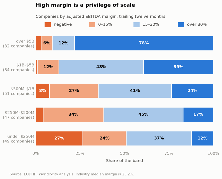
The industry median is a 23.2% adjusted EBITDA margin, but that single number conceals most of what is going on. Seventy-eight percent of companies above $5B earn more than 30%. Twelve percent of those below $250M do. Note also that the unprofitable share is low and flat across four of the five bands — 3%, 1%, 8%, 4% — and then jumps to 27%. The floor is not a gradient. It is a single step at the bottom.
But margin is only paid for at the extremes
The grid below is the part that matters for strategy: what the market actually pays for margin, in each band.

Read across any row and the same thing happens. Moving from a thin margin to a respectable one buys 10 to 20% in multiple.
What gets paid for is clearing 30%, and even that is inconsistent. It is worth an extra 2.79x at $500M–$1B and 2.02x below $250M, but only 0.62x at $1B–$5B and 0.23x at $250M–$500M. The $250M–$500M band is the flattest in the industry: 2.17x at a thin margin, 2.68x at an excellent one, across the entire range.
So the headline is not that margin is rewarded at scale and not below it. It is that ordinary margin improvement is rewarded with a 10-20% uptick in multiple, and exceptional margin is rewarded unevenly. Below $250M the middle of the range is flat enough to be striking: a company earning a respectable 20% is valued at 1.68x and one losing money at 1.76x. Measured across the whole range rather than in buckets, margin and multiple do move together at that size — a rank correlation of 0.33, which clears its significance bar — but the relationship lives almost entirely in the jump above 30%, not in the climb towards it.
Which measure actually sorts, and where
The Rule of 40 adds growth and margin together, so before asking how well it works it is worth seeing how it falls across the industry. It inherits both gradients, and the result is steep.

Eighty-eight percent of companies above $5B clear 40. Twenty-two percent of those below $250M do. The median Rule of 40 score runs 56.1%, 45.7%, 36.0%, 30.0% and 20.3% down the bands — a 36-point spread from top to bottom, wider than the gap on either of its two components alone, because the measure stacks them. Nearly a quarter of the smallest band scores below zero, which means neither growing nor earning.
Asking what each score is worth gives the Rule of 40 its best showing in this paper, and a sharp contrast with margin.
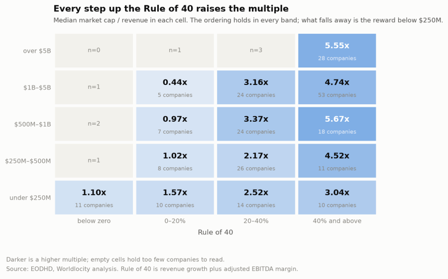
Where margin was flat across the middle of its range and only paid above 30%, the Rule of 40 sorts monotonically inside every band. Each step up the buckets raises the multiple at every size, with no flat stretch and no inversion. On this evidence the Rule of 40 is a better thing to manage against than margin, whose payoff was flat across most of its range. Whether it also beats growth on its own is a different question, and the next section takes it up.
What differs by size is the prize rather than the ordering. Clearing 40 is worth between 4.52x and 5.67x in every band above $250M and 3.04x below it. And the spread between best and worst cell is widest in the middle of the industry — nearly sixfold between $500M and $1B, against under threefold below $250M. A small company is rewarded for improving its Rule of 40, just less than a larger one would be for the same move.
What is the relative importance of Rule of 40, growth, and margin?
A measure on which 88% of large companies and 22% of small ones succeed is, to a significant extent, reporting size. “Passes the Rule of 40” tells you something real about a company, but a good deal of what it tells you is how big it is.
If growth and margin are priced so differently, the more useful question is whether the combined measure sorts companies against each other better than its parts do. Ranking the companies inside each band against their own market multiple — which holds size roughly fixed — shows where it earns its keep.
The figures below are rank correlations: each company is ranked within its band on the measure and again on market capitalization to revenue, and the two orderings are compared. The scale runs from +1, where the two rankings match exactly, through 0, where the measure tells you nothing about the multiple, to −1 for an exact inversion. Ranks are used rather than raw values so that one extreme multiple cannot set the result. The last column is the level a correlation has to beat, given how many companies are in that band, before it can be told apart from chance.
Revenue band | Companies | Rule of 40 | Growth | Margin | Significant above |
Over $5B | 32 | 0.39 | 0.74 | 0.11 | 0.35 |
$1B – $5B | 83 | 0.45 | 0.43 | 0.19 | 0.22 |
$500M – $1B | 51 | 0.56 | 0.49 | 0.31 | 0.28 |
$250M – $500M | 46 | 0.48 | 0.49 | 0.23 | 0.29 |
Under $250M | 45 | 0.48 | 0.45 | 0.33 | 0.30 |
Growth clears the bar in all five bands. Margin clears it in two. The Rule of 40 is a capable sorter through the middle of the industry, at 0.45 to 0.56, and the differences between it and growth alone there are inside the noise.
At the top it fails. Among companies above $5B, growth sorts valuation almost twice as well as the Rule of 40 does — 0.74 against 0.39 — and margin contributes nothing at 0.11. Splitting that band in half makes the point without any statistics: ranked by growth, the top half is valued at 10.48x against 4.24x for the bottom. Ranked by margin, the two halves come out at 5.50x and 5.55x. Sorting the largest software companies by profitability produces no valuation separation whatsoever, and adding margin to growth actively destroys information at that size.
One reading — an interpretation rather than a measurement — is that at that scale profitability is a solved problem and therefore carries no information, while the durability of growth is the live question.
What about common industry benchmarks?
Software companies use various indexes to benchmark themselves against other companies. One of the more commonly used benchmarks is the BVP Nasdaq Emerging Cloud Index and the metrics published alongside it. Let’s evaluate the components of this index and determine where it may and may not be useful for benchmarking.
BVP NASDAQ Emerging Cloud Index
Software companies of every size benchmark themselves against this index. For a large company that is reasonable. For a smaller one it is a comparison against a population it is not in, and the mismatch is larger than it looks.
Sorting the index's sixty-five constituents into the same revenue bands used throughout this paper:
Revenue band | Constituents | % of the index | % of its revenue | % of its market cap |
Over $5B | 12 | 19% | 66.7% | 73.7% |
$1B – $5B | 32 | 50% | 27.5% | 23.8% |
$500M – $1B | 15 | 23% | 4.9% | 2.2% |
$250M – $500M | 5 | 8% | 0.9% | 0.3% |
Under $250M | 0 | 0% | — | — |
Sixty-four of the sixty-five matched into this dataset; Waystar did not.
The index contains no company below $250M at all, and the five below $500M amount to 0.9% of its revenue and 0.3% of its market capitalization. Meanwhile 37% of the public software industry sits below $500M. Median revenue in the index is $1.42B, median growth 17.9%, and the median multiple 5.56x revenue. The median software company below $500M grows 9.6% at a 16.4% margin and trades at 1.90x.
So, a company with $300M of revenue measuring itself against the published index figures is aiming at nearly double the growth its actual peers achieve and a multiple close to three times theirs. That is not a reason to ignore the index. It is a reason to know which part of it, if any, resembles you.
The useful detail is that the index does not contradict the findings in this paper — it demonstrates it. Its constituents beat their peers in every band, as a quality-selected set should. But the multiple still falls with size inside the index itself, from 9.43x above $5B to 6.39x, 3.95x and 2.98x as the bands descend.
A note on the bands
These bands are conventions, and it is worth asking whether they sit where the economics change. Mostly they do, with one exception that matters.
Scanning revenue thresholds — comparing the forty companies just below each candidate cut with the forty just above — finds the sharpest margin break in the industry at about $2.5B, worth 10.7 points. The $1B–$5B band straddles it. That band reads as homogeneous at a 31.4% aggregate margin, and it is really two populations: 26.9% below $2.5B and 36.8% above. It is also the least balanced band, holding a third of all the companies against 12% in the band above it.
The $250M edge, by contrast, is real. Steps of seven to nine points of margin appear either side of it. The $500M and $1B edges sit in a flat zone — between roughly $450M and $1.3B no cut produces a step worth more than three points — so they are useful subdivisions rather than economic boundaries, which is worth remembering before reading much into a difference between those two bands.
One practical consequence: splitting the top at about $2.5B instead of $5B would produce more balanced groups and put a boundary on the largest real discontinuity in the data. It would also change the top band from 32 companies to roughly 55. Quintiles of this universe would fall at $261M, $600M, $1,109M and $2,584M, which is to say the three lower edges already in use are close to equal-count boundaries and only the top one is not.
The next version of this analysis will take on that task.
What the two gradients say together
Growth is rewarded at every size. Margin is rewarded unevenly everywhere, and ordinary improvement buys only 10 to 20% of multiple below $500M until the margin becomes exceptional. For a company under $250M that means the strategic menu is shorter than it looks: the harvest option — slow down, run tight, get paid for the cash — is largely unavailable, because the market does not pay for a 20% margin at that size. Growth is the only lever that reliably prices.
That is an uncomfortable conclusion, because it is the opposite of the advice a company usually receives when growth slows. It also squares with the finding, in the $250M cohort work, that efficiency which never becomes growth or margin does not reach the multiple. Here the point is sharper: below $250M, efficiency does not reach the multiple even when it does become margin — unless that margin is exceptional.
None of this says small companies are failing. Followed as a cohort rather than as a band, the companies that were under $250M five years ago grew faster than any larger cohort over the period, with two in five crossing $250M. The gradients describe where the economics are hard, not where the outcomes are bad.
What this does not establish
These are correlations against a market multiple at a single month end, not outcomes, and they do not show that moving a metric moves a valuation. Some cells are small — six companies under $250M earn above a 30% margin, three companies above $1B are shrinking — and anything resting on those should be treated as indicative. Revenue bands are not cohorts: membership churns as companies grow across a boundary or leave the market entirely, so a band's statistics describe the companies in it today and not the fate of the companies that were in it before. And a cohort defined by current revenue excludes the companies that failed at each size, which is the group a cautionary reading would most want to see.
Endnotes
[1] This analysis is based on 263 active public software companies · trailing twelve month (TTM) financial results as of 1 October 2026 · Market caps as of 30 September 2026 · Source: EODHD, Worldlocity analysis
[2] In this article margin means adjusted EBITDA, which equals EBITDA plus stock-based compensation (SBC).

Comments